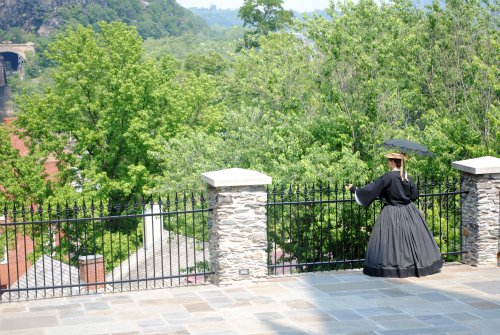
And here's my original image so you can see where I was starting from:
Picnic doesn't really have "actions" like Photoshop, but there are several advanced features that can create similar results simply and easily once you get the hang of them. For this particular photo, I did my version of a clean edit (adjusted the exposure, cropped the image) and then clicked "create" and then selected the "advanced" tab. I clicked on the "curves" tab and then selected "faded daguerreotype" preset and adjusted the fade to 10% so that a whisper of color peeked through, giving the impression of a hand-tinted image. Last but not least I added the clip art image and played around with the settings until I was happy with the end result. Not your typical definition of action, but I think it still works!
Be sure to check out the other lovely photos this week by clicking below;
have a great weekend everyone!


6 comments:
That is such a neat adaption of the original photo. I love Picnik! It's so much fun to play with!
BEAUTIFUL edit!! Love how old world that looks after editing!
What a GREAT edit! It fits perfectly with the photo!
Incredible processing. Definitely looks like an old photo.
I totally love that you interpreted the theme in a different way and put your own spin on it! That shot is great. It looks like it needs to be in a delicate gilded frame. That is exactly what it reminds me of.
Fantastic job! Thanks for joining in. :)
Very cool. Great edit.
Post a Comment